Product case study
TrailDesk
Route maps, gear lists and emergency contacts that still work where there is no signal.
Explore the case study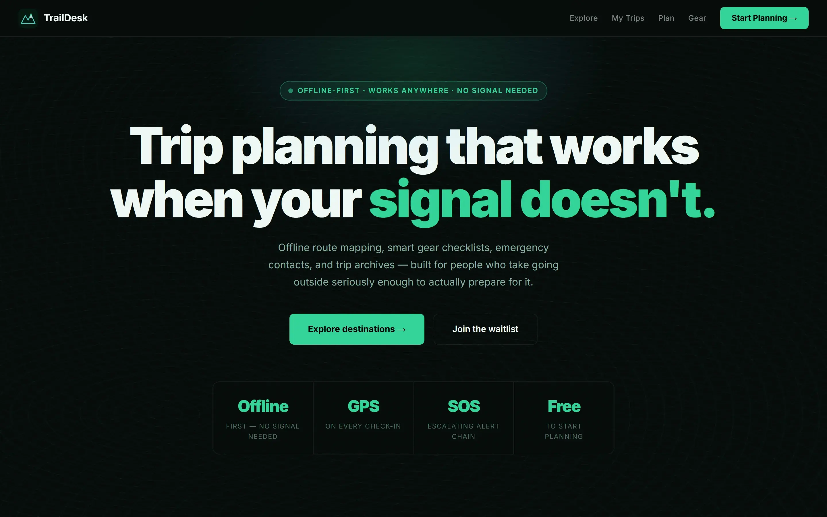
- Role
- Sole designer and engineer. Product structure, interface, and build.
- Stack
- Next.js, Offline first, Mapping
- Source
- View source on GitHub
A closer look
The problem
Trip plans often sit across map tabs, notes, gear lists, and messages. That becomes a practical problem when the connection disappears and the important detail is no longer easy to reach.
The objective
Bring route context, preparation, and essential contacts into one calm mobile workspace that remains useful beyond reliable coverage.
Research
I mapped what changes between planning at home and checking a plan outdoors. The useful information became a short sequence: choose a destination, understand the route, prepare the kit, and keep essential details close.
Design decisions
Organise around the trip
Destinations lead into route context and preparation instead of exposing separate tools. The interface follows the way a plan is assembled, so the next useful action stays clear.
Let mobile set the hierarchy
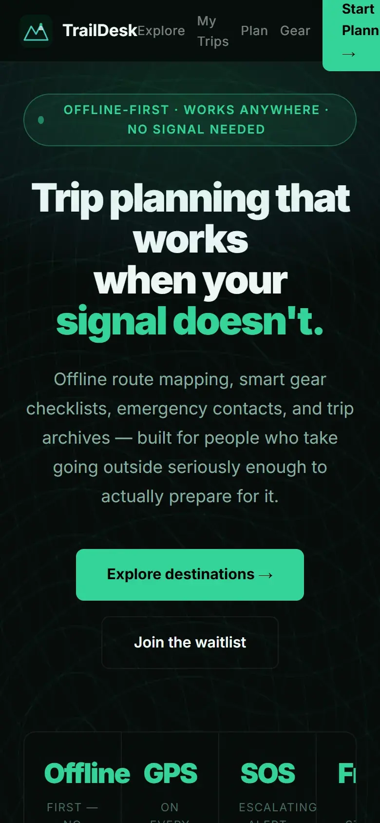
Wide screens keep destination context visible beside the work. On a phone, the same information becomes a direct reading order with actions placed where they are needed.
Engineering decisions
Keep critical information portable
Route details, lists, and contacts are structured as durable trip data rather than a collection of temporary screens. The product is designed to remain understandable after a connection drops.
Separate saved facts from changing conditions
The interface does not present cached planning information as live conditions. That distinction keeps an offline tool useful without giving old information false authority.
Challenges and tradeoffs
Offline access creates a responsibility as well as a convenience. A saved route can support preparation, but it cannot guarantee current weather, access, or emergency coverage. The design has to keep those limits visible without making every screen feel like a warning.
The product became clearer when I stopped treating the map as the product. The real product is a prepared trip that still makes sense when the map cannot update.
The solution
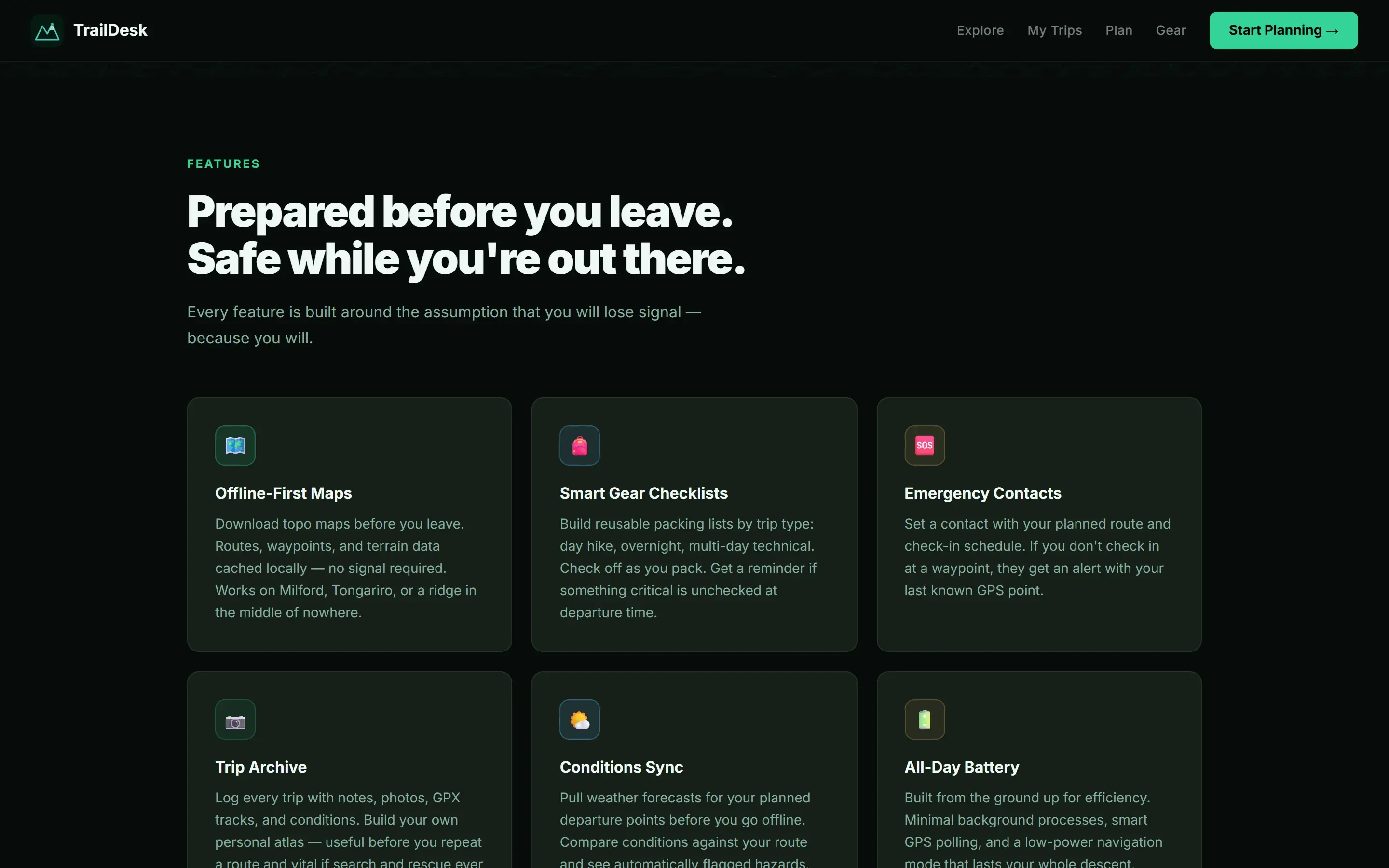
A responsive trip planning workspace that brings destination discovery, route context, gear preparation, and essential contacts into one continuous flow.
- Next.js
- Offline first
- Mapping
Results
The live product can be opened today to browse destinations, inspect the planning structure, and compare the complete desktop and mobile experience.
Lessons learned
Offline design is less about adding a cache badge and more about deciding what remains trustworthy. Future development should deepen saved route detail while preserving a clear boundary around information that can change.