Lab
Interface concepts.
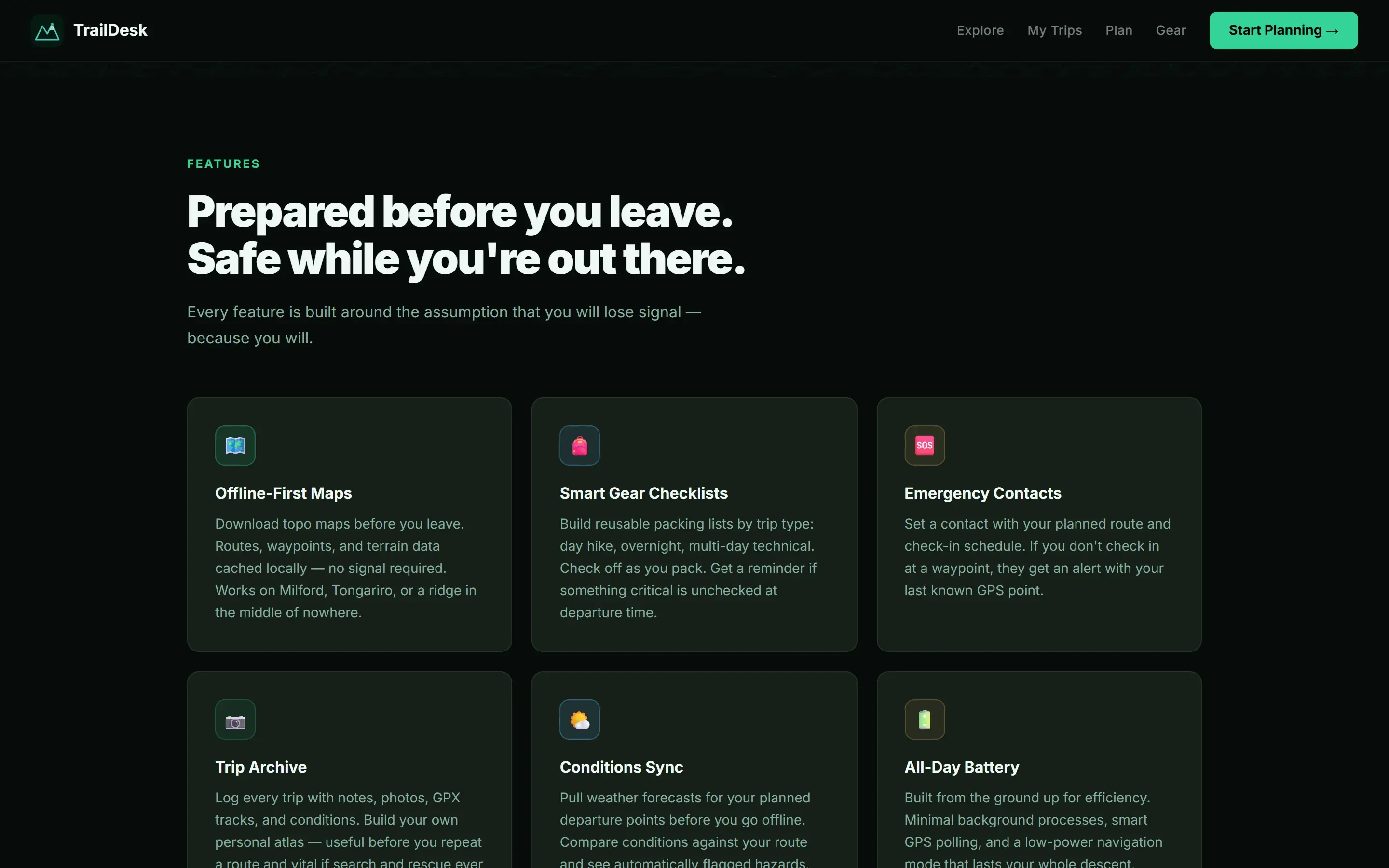
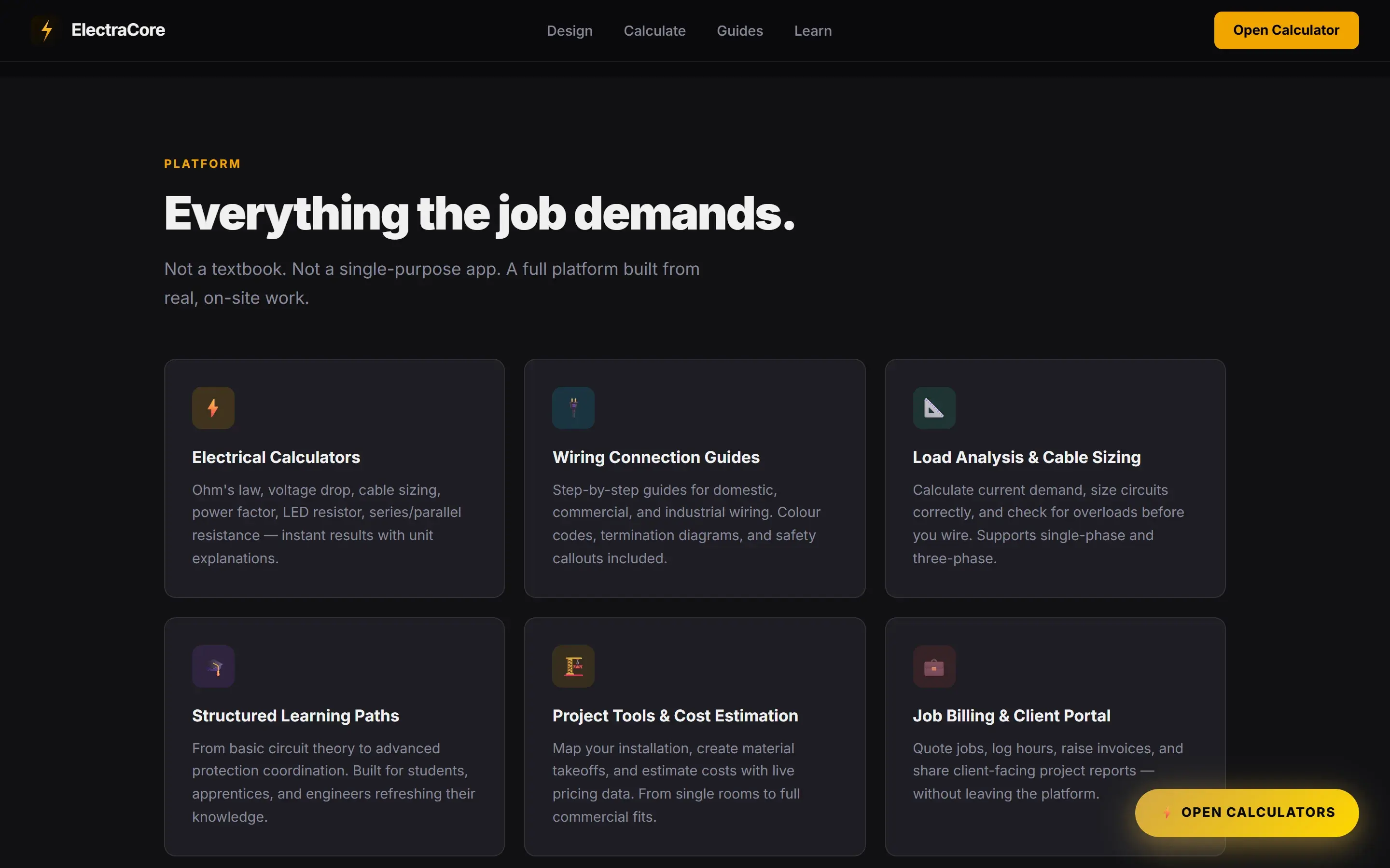
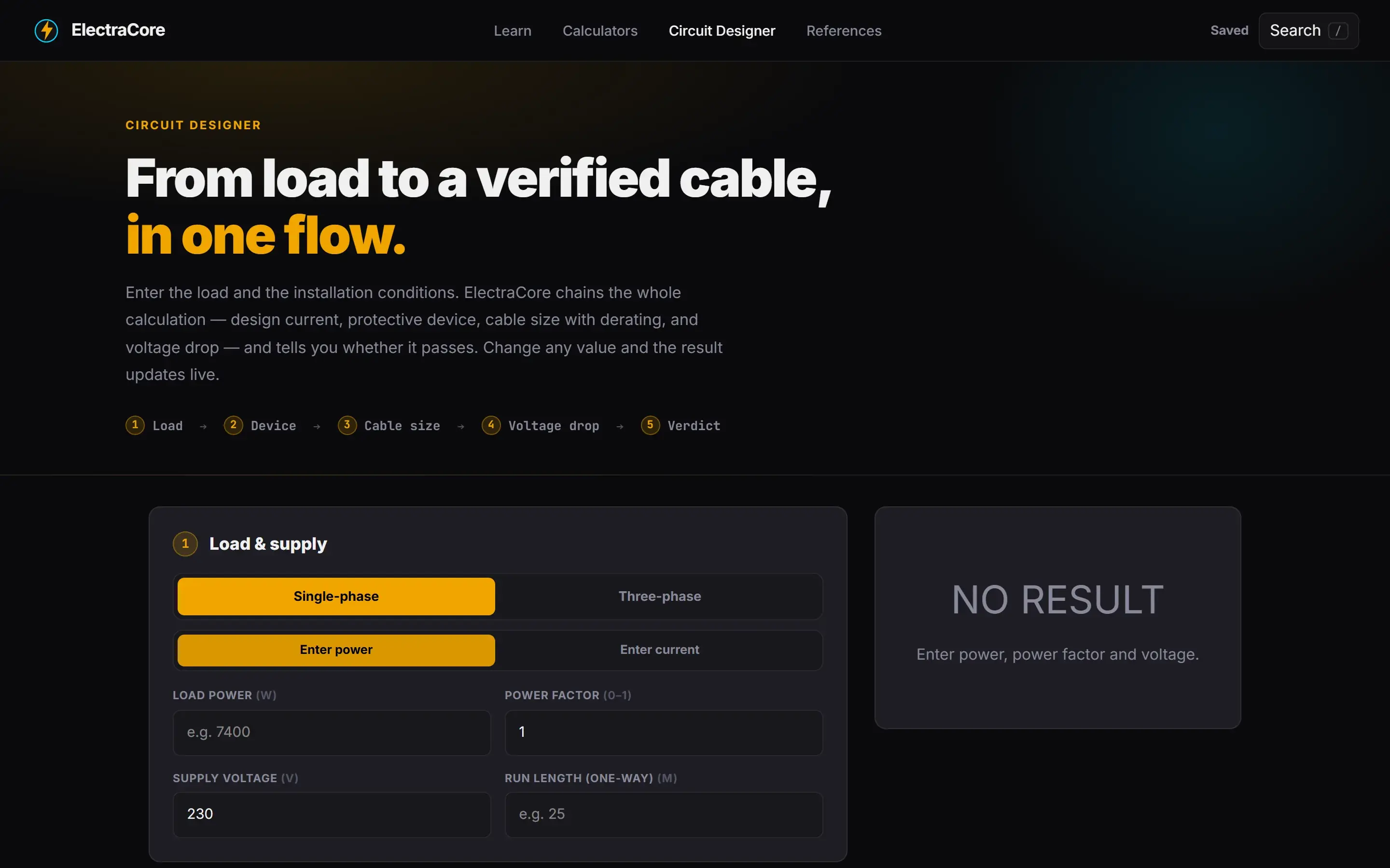
Where the design system work goes to be tested. Each of these is an independent study of a full product interface: a different industry, a different visual identity, one discipline held steady across all of them.
NoteIndependent interface studies that explore one design discipline across different industries. These are design concepts, not shipped products or client work. Every company name, logo and figure shown inside them is fictional sample data.

Atlas Ops
Business operationsA control surface for a whole business, where revenue, invoices, projects and work orders stay calm at high density.
What it demonstrates- A revenue, invoice and work order overview that stays scannable as the data thickens
- One accent colour carrying status across eight screens, so meaning never rests on hue alone
- Tables, charts and schedules sharing a single spacing rhythm
ScreensDashboard, customers, projects, calendar, invoices, reports, team directory, settings.

Pulse CRM
Sales and CRMA relationship workspace built around the pipeline, so a deal, its people and its history sit together.
What it demonstrates- A pipeline board that reads as a funnel before you read a single label
- Contact profiles that surface the next action, not only the record
- An email timeline woven into the deal rather than parked in a separate inbox
ScreensPipeline, contact profile, companies, email timeline, calendar, opportunities, reports, settings.

SprintFlow
Project managementAgile delivery made legible, from the kanban board to the backlog to the velocity a lead actually checks.
What it demonstrates- Kanban, backlog, timeline and workload views built from the same components
- Status carried by shape and label together, never by colour on its own
- A velocity view that answers the one question a delivery lead keeps asking
ScreensKanban board, sprint backlog, timeline, calendar, team workload, issue tracker, reports, settings.

Insight
AnalyticsAn analytics suite that stays readable as it deepens, from a ten second overview to a full report builder.
What it demonstrates- An executive overview a non analyst can read in ten seconds
- A report builder that stays calm while offering real depth
- Each theme tuned so dense figures never fight the eye
ScreensExecutive dashboard, revenue, customer insights, geography, forecasting, performance, KPI explorer, report builder.

CommerceOS
CommerceA store back office shaped around the operator's day, with products, orders, inventory and shipping one move apart.
What it demonstrates- Products, orders, inventory and shipping all reachable in a single move
- A dashboard that leads with the numbers a shop owner opens first
- Eight screens that stay consistent across very different tasks
ScreensStore dashboard, products, orders, customers, inventory, discounts, shipping, analytics.

Nimbus Admin
Platform administrationThe control room of a platform, where users, keys, billing and live health each get room to breathe.
What it demonstrates- Users, organizations, keys and billing each given their own clear space
- A live system view that reads as reassuring rather than alarming
- Audit and security surfaces designed to be trusted at a glance
ScreensUsers, organizations, API keys, billing, audit logs, system monitoring.

Nova
Design systemA design system documented as a product in itself, with tokens, components and accessibility guidance in one place.
What it demonstrates- Tokens, components and accessibility guidance treated as one product
- Every colour pair carrying a stated contrast ratio, not an assumed one
- Guidance written to be used, not filed
ScreensTypography, colour, buttons, forms, navigation, components, icons, accessibility.

Eight dashboards, one system
Cross domain, darkOne visual language stress tested across eight role based dashboards, to prove a single system can dress very different jobs.
What it demonstrates- Eight role based dashboards built on a single component set
- One dark theme holding analytics, commerce, finance and support together
- Consistency that reads as intent rather than repetition
ScreensAnalytics, ecommerce, project, CRM, finance, helpdesk, HR and learning dashboards, one dark theme.

Nine dashboards, one system
Cross domain, lightThe same exercise in a light theme, nine dashboards across different domains sharing one component set.
What it demonstrates- Nine dashboards unified by one spacing and type system
- Dense figures kept legible on a bright ground
- A light counterpart that proves the system travels across modes
ScreensAnalytics, sales, project, customer, finance, marketing, inventory, HR and support dashboards, one light theme.